Branding, Visual Systems & Icons
Branding & visual systems
FHI 360 Strategic Partnerships
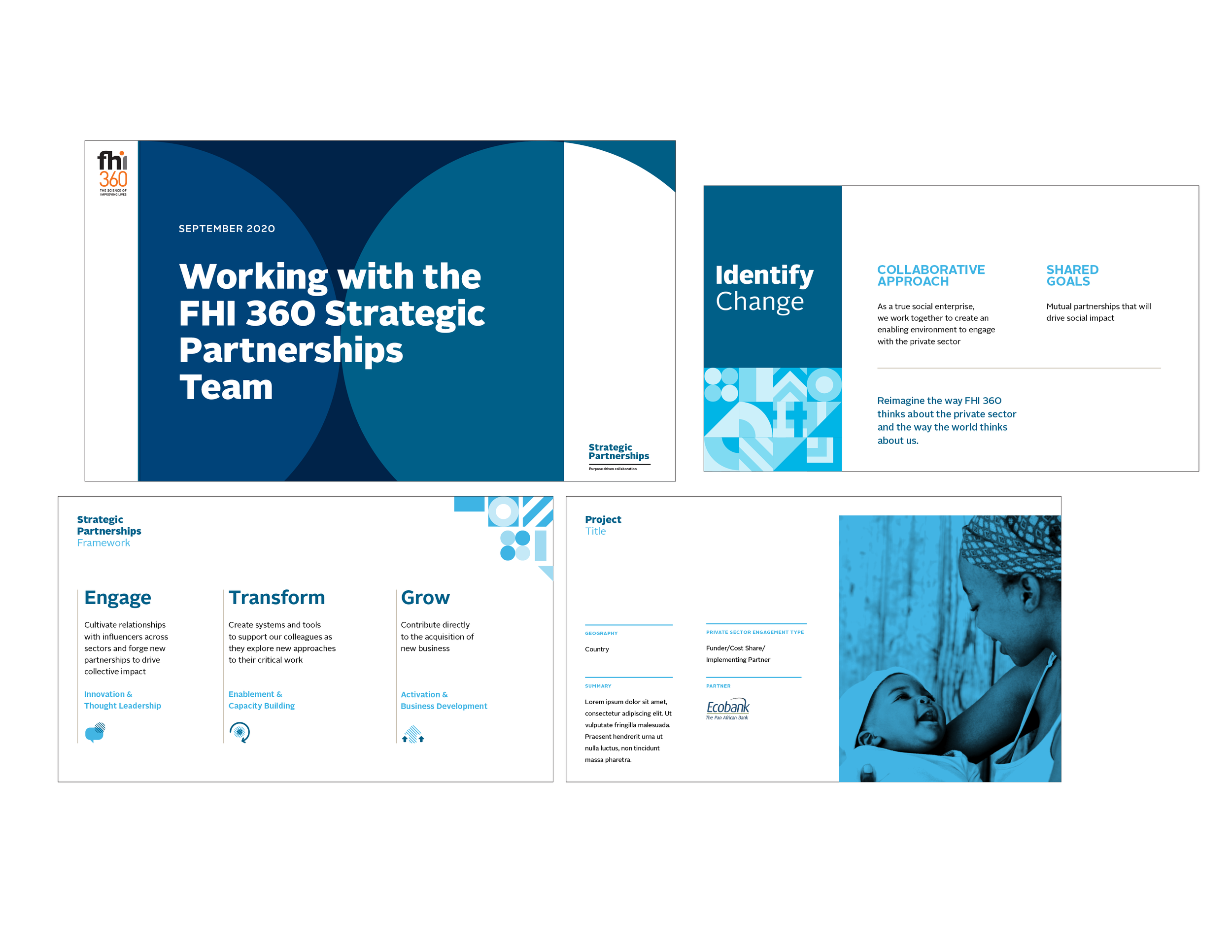
The Strategic Partnerships team at FHI 360 required a refreshed brand presence to enhance their approach when engaging with external organizations for philanthropic and corporate collaborations aimed at advancing the organization's mission. To meet this need, a simple wordmark and an engaging visual system consisting of icons and patterns were developed. These elements were applied to various collateral materials, including pitch decks, leave-behinds, and brochures.
Concept Design & Implementation
Team: Krista Gill, Creative Direction
Dominion National
Dominion National required a full-scale rebrand to update all materials used to market their services. The concept of a path inspired the logomark and subsequent collateral and site design. Bright colors and engaging photography reinforced the idea that the company guides enrollees on a comprehensive path to better benefits. Alongside traditional collateral, the rebrand included a new and reimagined office space. Engaging signage and design elements were applied throughout the office to create an atmosphere of excitement and encourage motivated staff.
Creative Direction, concept Design & implementation
FHI 360 Global Education
Like the Strategic Partnerships team, FHI 360’s Global Education division needed a bold brand presence to distinguish itself from other education-driven organizations. To achieve this, bold colors, typography, and patterns were used to create a suite of materials, including fact sheets, brochures, emails, and reports, helping them stand out in a crowded field.
Concept design & iImplementation
Team: Krista Gill, Creative Direction
Georgetown University: Center for Integrated Social Impact
(now known as Georgetown University’s Center for Social Impact Communication)
Georgetown University’s Center for Social Impact Communication is a research and action center dedicated to increasing social impact through the collaborative efforts of marketers, communicators, fundraisers, and journalists. The logomark, reminiscent of a lighthouse, symbolizes guiding practitioners toward greater effectiveness. The lighthouse "rays" form a pattern used throughout collateral materials, reinforcing the ideas of influence and clarity. This inspires practitioners and graduate students to define their purpose, enabling them to create impact within their organizations and for the global community.
Creative Direction, concept design & implementation


